

Color is back. Finally!
Why I’m done with beige and what I saw at Kips Bay.
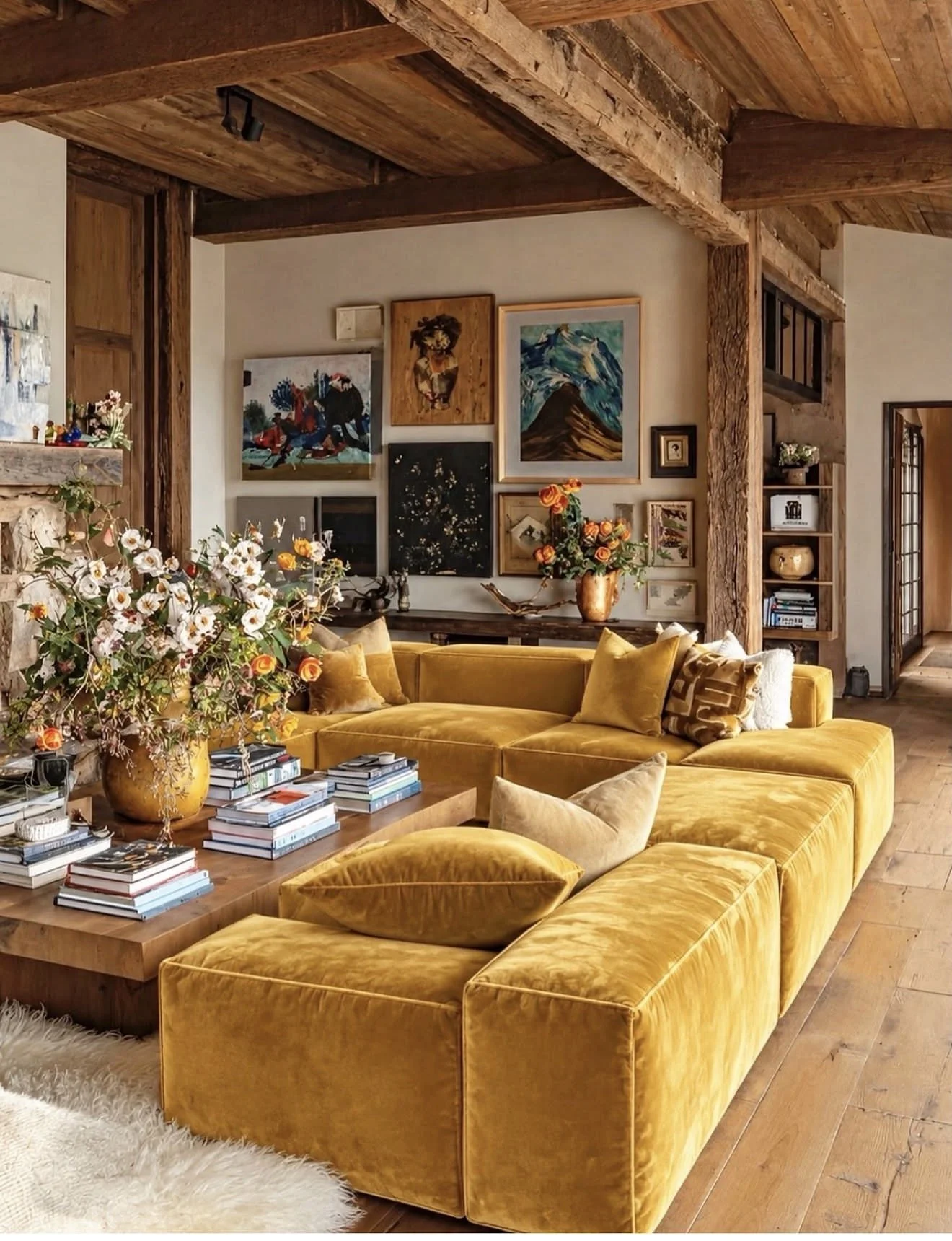
Yellow velvet sectional living room with gallery wall
Finally. Color is back.
Safe is out. Is everyone as tired of monotone rooms as I am? I just want to tell people: live a little.
I recently posted this living room. A yellow velvet sectional, reclaimed beams, a gallery wall that doesn’t try too hard. It’s not my design, but it’s close to an office we just finished in Jackson Hole. There we used bright yellow linen sofas from Sixpenny. Linen instead of velvet, because a mountain house should feel relaxed, not precious.
That post got 150,000 views. My most-viewed ever.
I don’t think that’s an accident. People want homes that make them smile. They’ve had enough of rooms that just avoid mistakes.
I saw the same thing in New York last week at the Kips Bay Show House in Greenwich Village. Color was everywhere. I counted one beige room in the whole brownstone. Vibrant marble in almost every space. Rooms so layered I had to stand still to take them in.
The objection I hear most is: “I don’t want to get sick of it.”
Here’s the thing. Clients get sick of bland too. They just don’t notice until years later, when the house feels like nobody lives there. A color you chose on purpose, with the right fabric and the right light, keeps feeling like yours. A neutral you picked out of fear never does.
So when a client tells me they want their home to look like an RH showroom, that’s my cue to keep walking. I’m not the designer for that. There are plenty who are. Below are all the amazing colors, materials and textures used at this year’s Kips Bay Show House in New York.
The Kips Bay Show House: A Color Report
I walked through the Kips Bay Show House in Greenwich Village last week. It was a brownstone full of color, and I counted one beige room in the entire house.
What struck me wasn’t just that color was back. It was which colors. Nobody was doing candy brights or primary colors for shock value. The palette running through the house was earthy: rust, terracotta, olive, blush, deep brown. These are colors that come out of the ground, and that’s why they work. They feel warm and lived-in, not trendy.
Here’s what stood out, room by room.
The Living Room: Color Through Texture

Kips Bay Show House living room with pink walls, olive bouclé sofa and tapestry
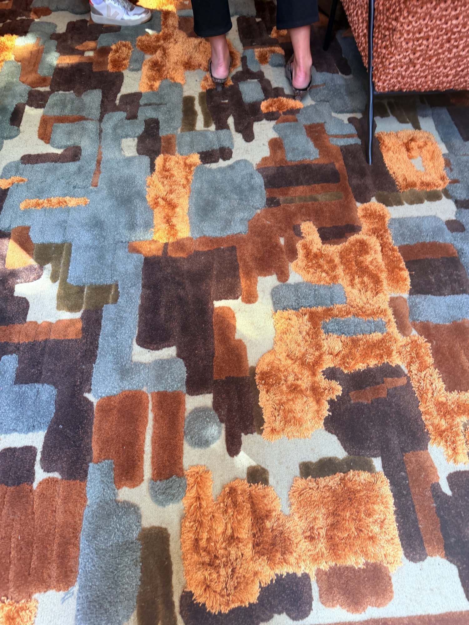
This room was a lesson in layering. The walls are a warm pink, almost like tinted plaster. A large tapestry in black, cream and rust hangs over an olive bouclé sofa. Underneath it all is a sculpted shag rug in rust, slate blue, chocolate and moss.
On paper, pink, olive, rust and blue sound like too much. In person they’re calm. That’s because every color comes in through texture instead of flat paint. The nubby sofa, the high-and-low pile of the rug and the soft walls give your eye somewhere to rest.
Look closely at the rug.
Sculpted rust, blue and brown shag rug detail
The rust sections are cut long and shaggy, and the blue and brown are cut short. So the color is also giving the rug its shape. That’s the kind of detail that separates a custom rug from a catalog rug.
What I’d take for a client: If a client is nervous about color, start with texture. Use a colored bouclé or a sculpted rug before you touch a painted wall. It reads as rich, not loud.
The Reading Nook: Pattern Holding Its Own

Reading nook with green and copper curved sofa and ringed cabinet
A curved sofa in a deep green-and-copper fleck, a rust and brown plaid throw, and a cabinet covered in rings of every color you can name. In theory those three patterns fight. They don’t, because they all share the same copper and green base. The cabinet is the loudest thing in the room, and everything else steps back to let it lead.
What I’d take for a client: Let one piece be the star. Pull its two main colors into the fabrics around it and you can use as much pattern as you like.
The Green Kitchen: Stone as the Color Story
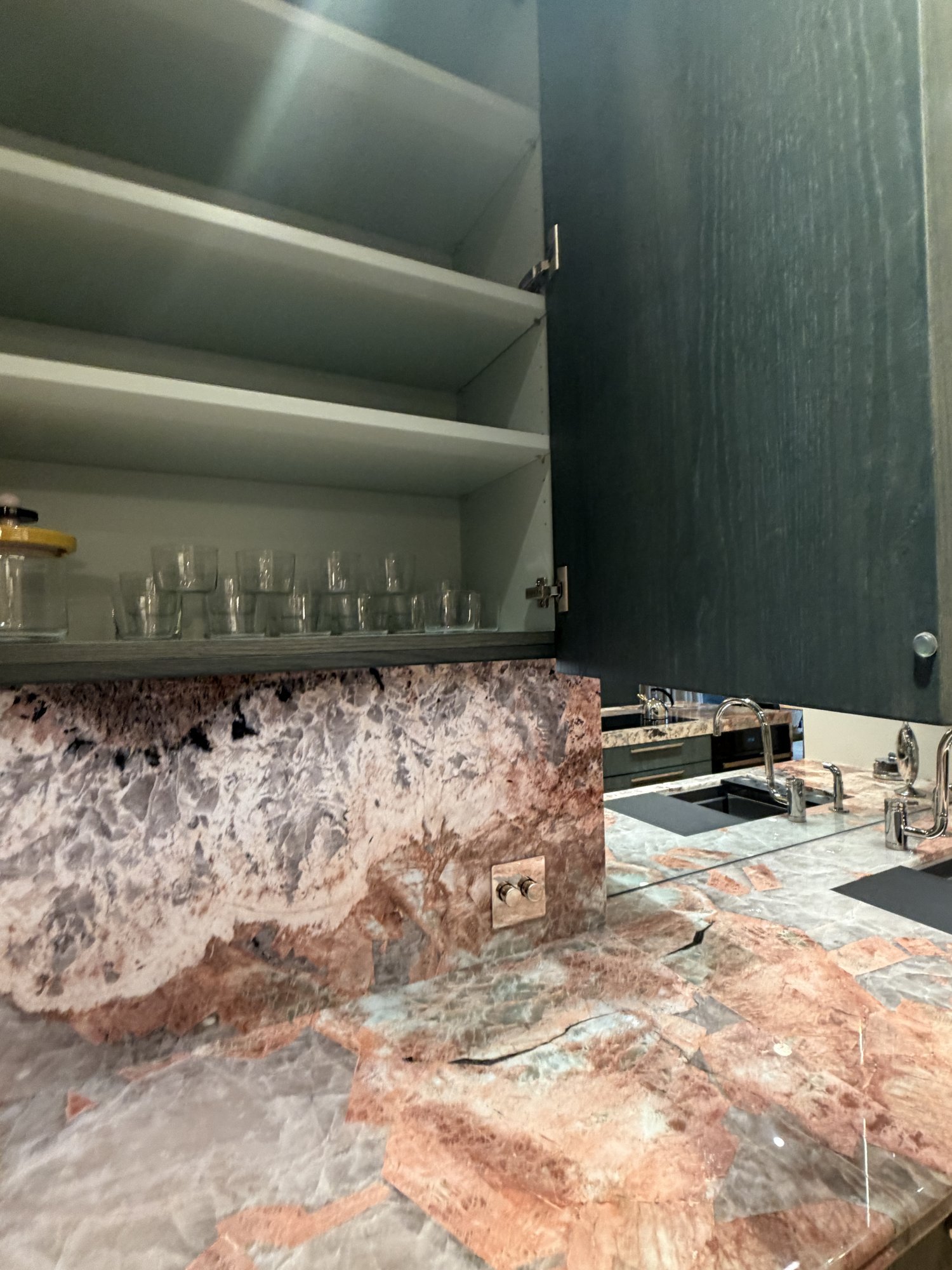
Green rift oak kitchen with pink and lilac stone
This was one of my favorite spaces. The cabinets are rift oak stained a deep bottle green, so you can still see the grain. They sit against a pink, lilac and grey stone that looks like a geode sliced open. The end of the run curves into open stone shelves. It’s a beautiful detail.
Then open a cabinet: the inside is color too. Nobody sees that until they reach for a glass, and that’s the point. It’s color for the person who lives there, not the person visiting.
What I’d take for a client: Pick the stone first. Let it choose your cabinet color, not the other way around.
The Pink Marble Bath: Monochrome, But Not Beige
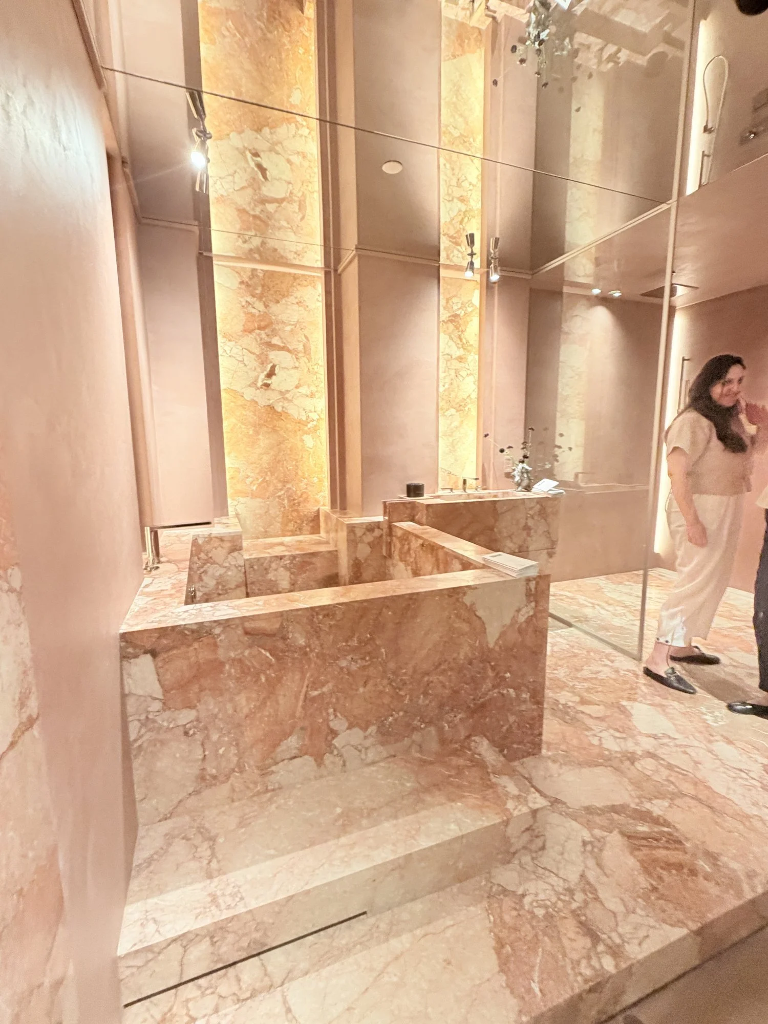
Pink marble bathroom with block stone tub
Here’s the proof that a monochrome room doesn’t have to be boring. Everything is pink: the plaster walls, the floor, the stone tub built like a set of blocks. Backlit stone panels glow amber behind it, and a mirrored ceiling doubles everything.
It’s all one color, yet it has more life than any white marble bathroom I’ve seen this year. The veining gives you movement. The lighting gives you warmth.
People always ask me whether marble in a bathroom is a mistake. It isn’t. Marble ages, and that’s the beauty of it. A room like this only gets better with time.
What I’d take for a client: If a client insists on a single-color room, don’t settle for beige. Choose one warm color and repeat it in every material.
The Striped Bedroom: Soft Color, Big Impact
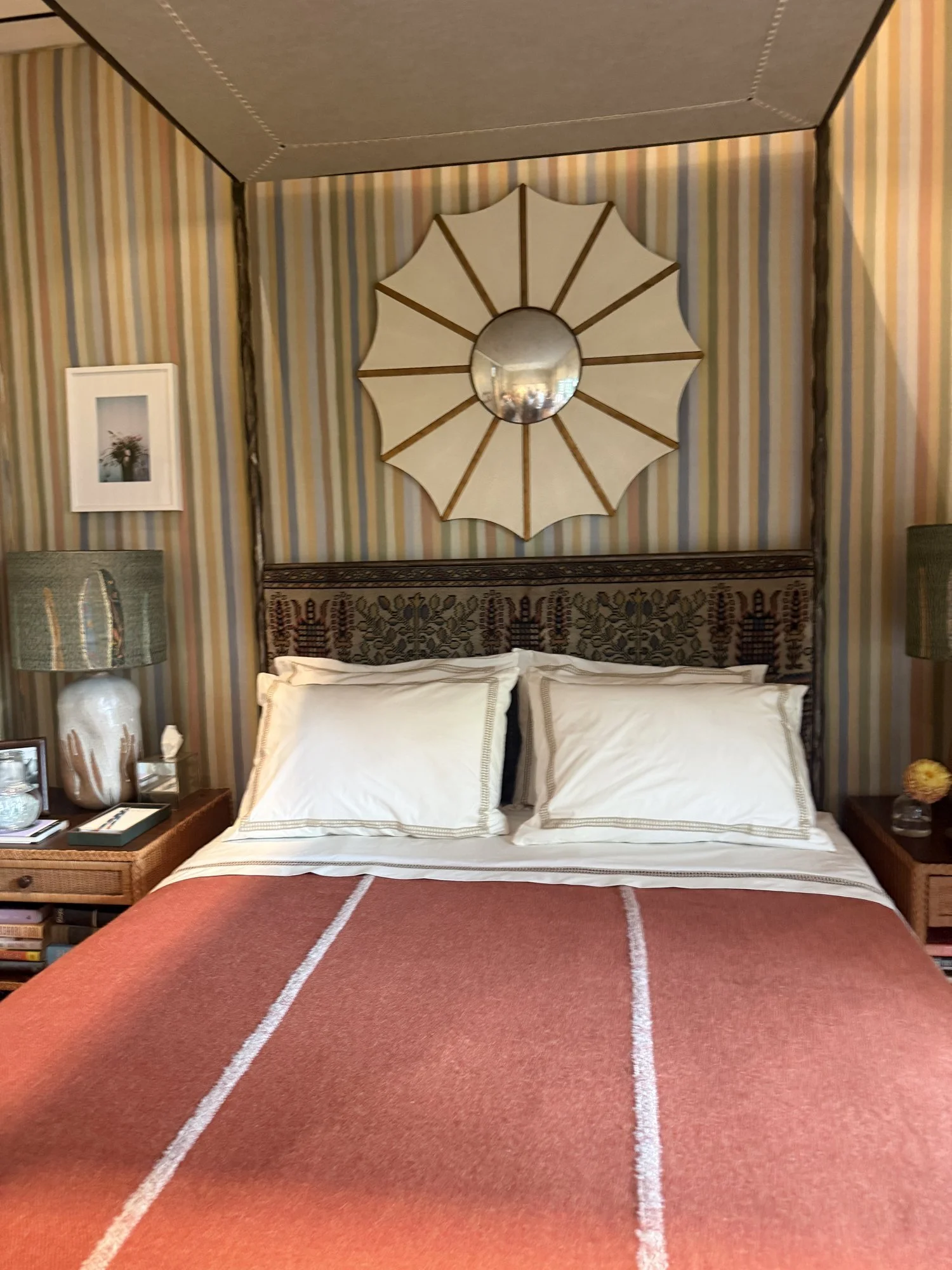
Pastel striped bedroom with terracotta blanket
The walls are covered in a hand-painted-looking stripe of butter, blush, powder blue and sage. There’s an upholstered canopy, a headboard made from an old woven textile, and a terracotta wool blanket with a white stripe across the bed.
This room shows you can be colorful without being bold. Each shade is soft, but together they’re joyful. The terracotta blanket keeps it from going too sweet. And the crisp white bedding lets it all breathe.
What I’d take for a client: This is the room for the client who says, “I want color, but I want to sleep.” Pastels with one grounding earth tone.
The Red Study: The Room That Divided Everyone
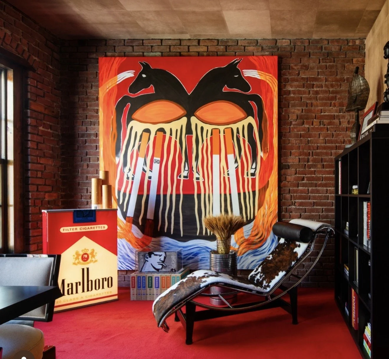
Red carpeted study with cowhide chaise
This room had red wall-to-wall carpet, exposed brick, a Le Corbusier chaise in cowhide, an enormous painting of horses and cigarettes, and a cigarette-pack sculpture you couldn’t miss.
It’s a statement, and I respect the commitment. The red carpet running into the red painting works; it makes the art feel like part of the architecture. But the tobacco imagery made it feel more like a gallery installation than a room someone lives in. I loved the color, but the theme was a bit much for me.
What I’d take for a client: A red floor is braver than a red wall, and it works. Keep the art personal, not themed.
The Walnut Kitchen: Warm Wood Meets Bold Stone
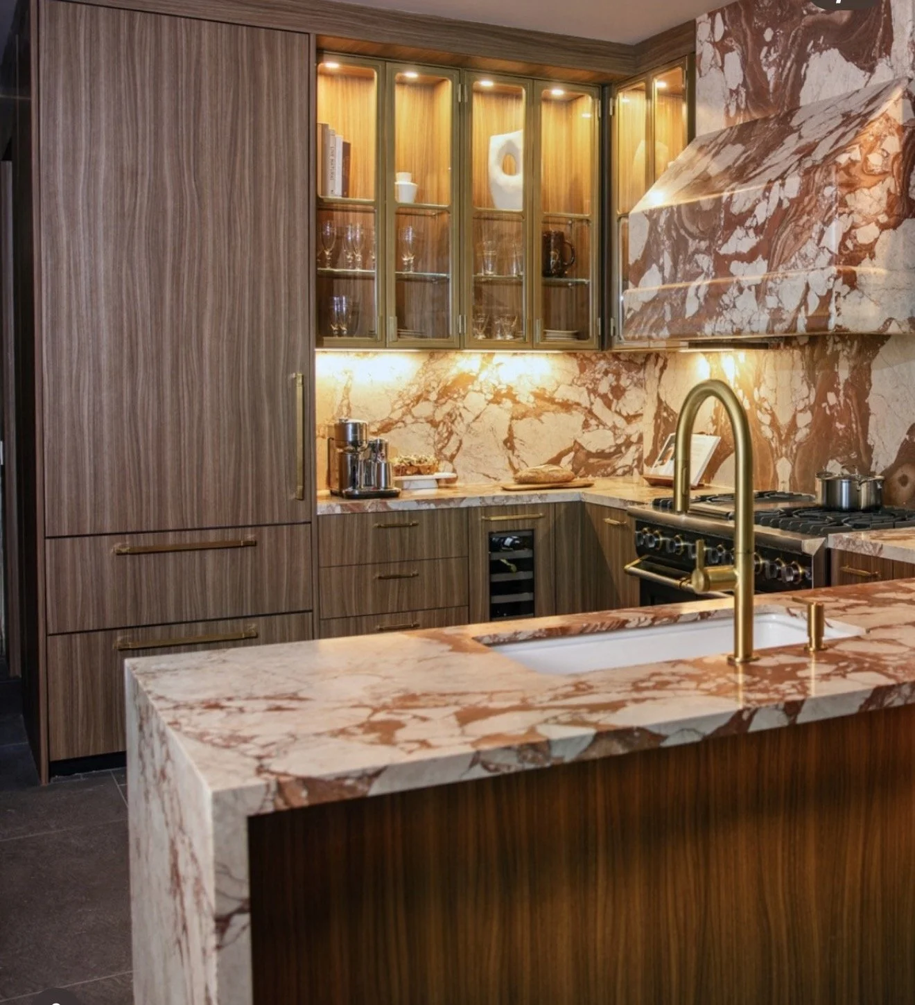
Walnut kitchen with red breccia marble hood
Walnut cabinetry, brass glass-front uppers, and a red and cream breccia marble that runs up the backsplash and wraps the hood. The stone does all the work here. Take it away and you’d have a nice, forgettable kitchen. With it, you have a kitchen you’d remember.
What I’d take for a client: Wrapping the hood in stone is worth the money. It’s the one move that makes a kitchen look custom.
My Takeaways
Earth tones are the new neutral. Rust, olive, terracotta and blush replace beige without feeling risky.
Texture carries color. The richest rooms put color into rugs, bouclé and plaster, not just paint.
Let stone lead. Nearly every standout room started with a dramatic stone.
Monochrome is fine. Beige isn’t required. One warm color, repeated, beats a safe neutral.
Color hidden inside cabinets is a luxury. It’s for the owner.
The rooms that stayed with me weren’t the loudest ones. They were the ones where every color had a reason to be there.
That’s what I want for my clients too.
This piece first appeared on my Substack, Design Secrets. Subscribe here to get new posts in your inbox.