

Why I Never Let My Clients Color-Match Farrow & Ball Paint Colors
Why I Never Let Clients Color-Match Farrow & Ball
Every few months, a client sends me a paint chip and a version of the same question: “Can’t we just have this color-matched in Benjamin Moore or Sherwin Williams ? It’s the same color, right?”
I understand the instinct. Farrow & Ball is not cheap — a gallon of their Estate Emulsion runs significantly more than most premium paints, and on a large project, that adds up fast. Color-matching feels like a smart, sophisticated shortcut. Same hue, lower cost, problem solved.
Except it isn’t the same color. Not really. And once you understand why, you’ll never look at a “matched” swatch the same way again.
Color-matching only sees color
When a paint store scans a chip with a computer, the machine reads reflected light and calculates a formula to reproduce that reading in a different base — usually an acrylic or vinyl formulation entirely unlike what Farrow & Ball actually uses. What the scanner cannot read is everything that makes a Farrow & Ball color behave the way it does in a real room: the specific pigment load, the way those pigments are ground, and the finish of the paint film itself. A machine match can get you close, but it’s never as good.
Farrow & Ball colors are built differently
Farrow & Ball still uses a traditional, pigment-rich process that most modern paint manufacturers moved away from decades ago. Their colors are famous for a specific kind of depth — a chalky, layered quality that shifts subtly depending on the light hitting it, the time of day, and the sheen you’ve chosen. That shift isn’t a flaw; it’s the entire point. It’s why a color like Hague Blue or Setting Plaster reads differently at 9am than it does at dusk, and why it feels alive on a wall instead of flat.
A color-matched acrylic formula is built to hold a single, stable reading. It won’t move with the light the same way. On paper, and in a five-inch swatch under store lighting, the match can look convincing. On sixteen feet of living room wall, in shifting daylight, the difference becomes obvious — usually in ways that are hard to name but easy to feel. Clients notice something is “off” long before they can explain what.
The finish doesn’t match either
Even when a color-matching lab nails the hue reasonably well, the sheen and texture rarely translate. Farrow & Ball’s finishes — from the famously chalky Estate Emulsion to their oil-based Full Gloss — have a specific hand-applied, almost powdery quality that’s part of the brand’s signature look. Most color-matched alternatives are formulated for durability and scrubbability first, which means a smoother, more plastic-feeling film. On trim and cabinetry especially, that difference in finish is often more noticeable than the color itself.
My F&B lesson:
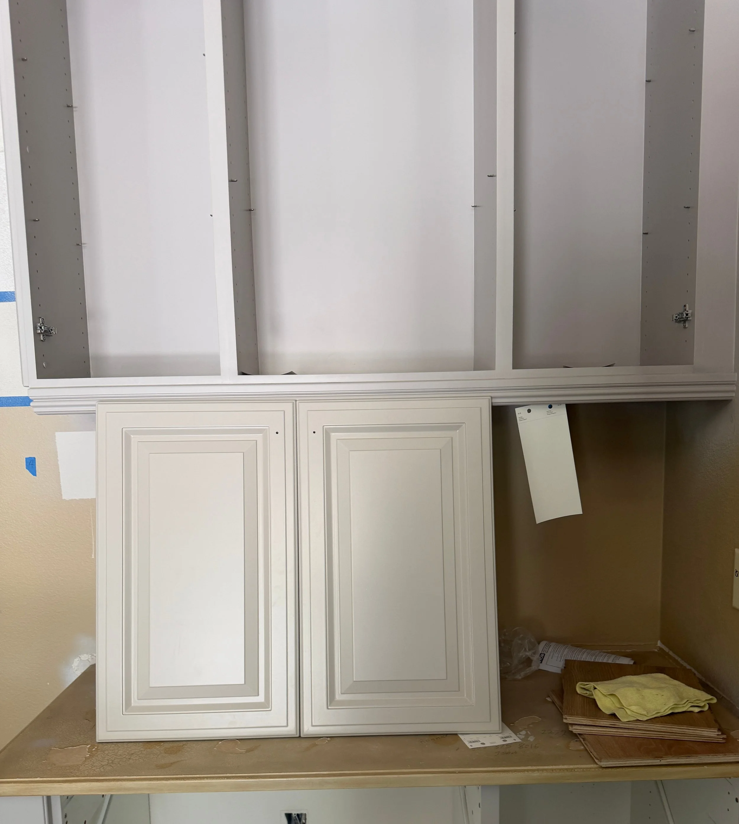
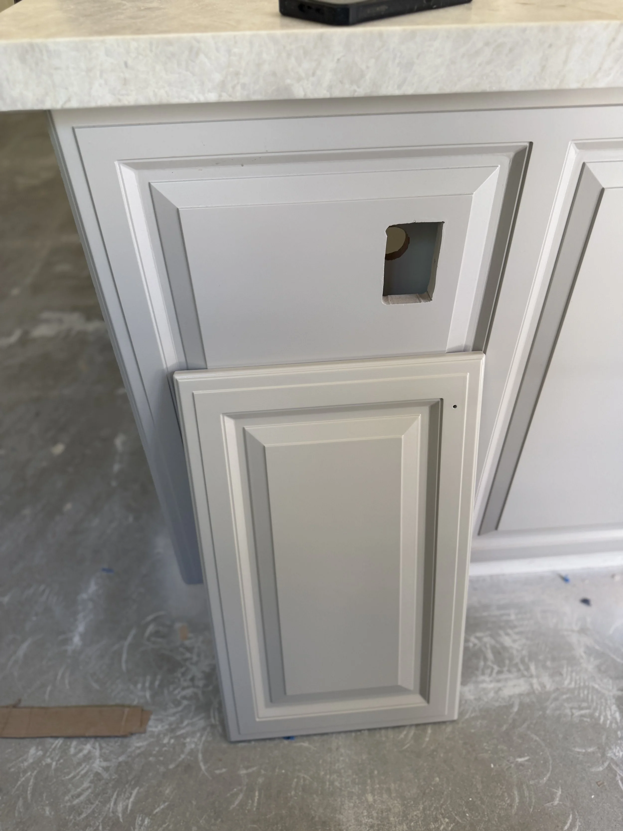
I had a client with a very tight budget and a large wish list. I suggested painting her existing kitchen cabinets because they were solid wood, just in the 90’s gold, crackled, faux finish. Yuk! She had already found a Taj Mahal quartzite that she was in love with so I went about trying to find a cabinet color that would bring the warmth to her home without feeling dated. I found this amazing Farrow & Ball color called Elephant’s Breath. (Great name!!!) It looked beautiful with the Taj Mahal, it enhanced all the brown swirls and looked pretty next to the onyx looking parts. The problem was the sticker shock, and the painter’s eye roll. Why do some trades never want to try anything new? The painter said he could definitely match the same color with a less expensive brand of paint. At this point I should have said it won’t work because I had tried it with a flip house I did. I wanted a “Hague blue” (Farrow &Ball ) door but we were already way over budget. So I let them color match and was presented with a very unsophisticated royal blue door. Anyway, back to the kitchen….. the painter not only got the color match but didnt show me before he applied to ALL of the cabinets. No sample to approve, just finished. WTF! The entire kitchen cabinetry was lavender with a beige purple hue. My job is not to panic but to find solutions. So I called a color consultant I knew. I thought she could find a white paint that would minimize the purple and bring us back to brownish beige, however she took one look and said, “This can’t be fixed, we have to repaint.” In the end, we got the right color and all was well but my client felt an immense amount of stress, as she was trying to leave for a birthday trip.
So when does color-matching make sense?
To be fair — it isn’t always the wrong call. For a low-visibility utility space, a rental property turnover, or a client with a strict budget ceiling who understands the tradeoff going in, a good color-matched approximation can be a reasonable compromise. The key word is informed. The client should know exactly what they’re trading away, not discover it after the paint is dry.
The lesson I learned is that it is really important for me as a salesman to explain to my clients that sometimes paying the extra money upfront saves unimaginable amounts of pain in the long run.
If you’ve ever had a contractor suggest color-matching to save a few hundred dollars, I hope this gives you the language to push back.
Originally published on Design Secrets ….. spilled: https://annecarr1.substack.com/p/why-i-never-let-my-clients-color